I was taking some notes based on my first impressions mostly on the theme but also some surface level observations on functionality and calc stuff too, was gonna make a better thread but got lazy so I’m just copying the notes from discord
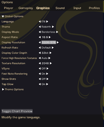
those are my settings, low resolution so keep that in mind also if my settings are otherwise awful and bad please tell me.
General stuff / main menu
not gaming, dead space, can’t see shit. Classic options menu is also fucked
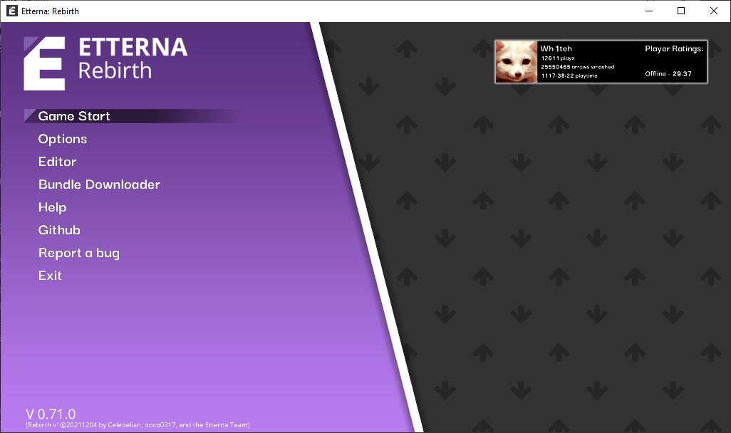
this gradient looks ugly, but I also hate purple so idk. Being next to flat grey probably makes it more noticeable.
sounds are goofy.
I like the purple corner for the selected item
I guess the profile box could be scaled up a bit. Compared to the text on the left it looks so tiny
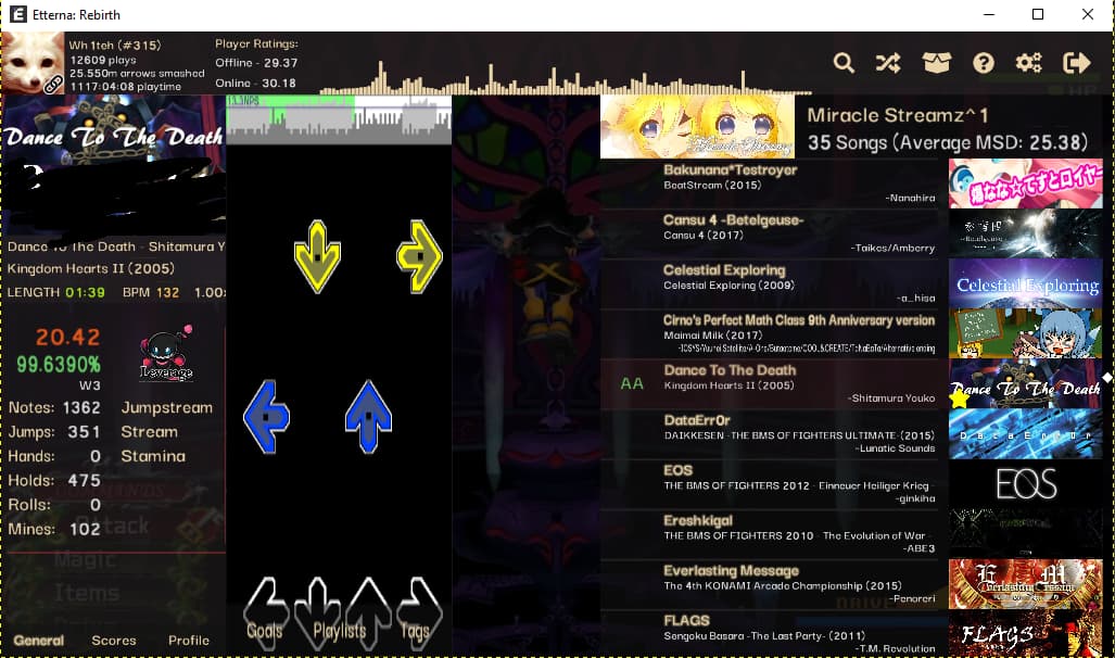
Song select
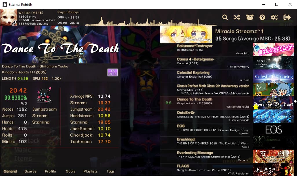
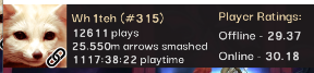
why does this differ from main menu? What do you mean millions of arrows mashed, Where’s my big number? Main menu doesn’t show online rating, technical limitation or?
Help menu looks awesome
Settings and color config in song select, awesome
Downloads tab awesome

visualizer ugly alignment
artefacts around some texts and cdtitles
![]()
I think long texts should be truncated, even tho it might ruin some memes

bad placement for favs, mirror etc, can get lost with busy looking banners
artist and song title on the same line, not epic
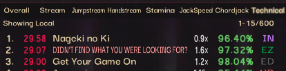
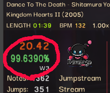
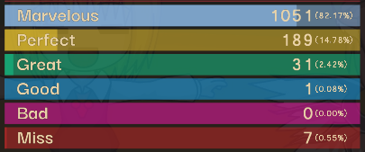
(calc) super long meme anchors still king of tech
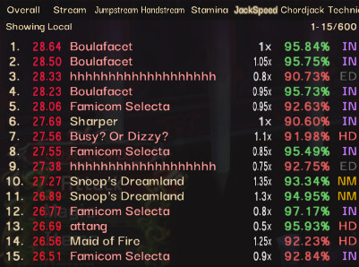
(calc)boulafacet is still a thing somehow, at least hhhhhhhhhh doesn’t give free 35s anymore. Snoop’s dreamland makes a comeback 
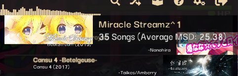
oh my god make it taller, disable banner or something
like??? and you could stack the texts some
also I would much rather keep skillset info than see how many notes a chart has
this animation at the top looks sorta weird maybe because there’s no such thing for the bottom of the wheel (which there probably should be, you can reach the end of the wheel if you scroll with mouse fast enough)
For all of these tabs besides ‘General’ I would much prefer if the banner went away and I got to see more info

I wish these fonts weren’t so low res still
so no anti-favorite function? cringe (ye xd)
![]()

there’s so much room for a pause/play button here, just something that would feel pretty nice even tho no one really needs it if they know about the shortcut.
tho it could free up the rightclick for other functionality in the future.
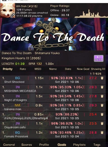
I really like how there aren’t like 10 tabs at the bottom anymore
clicking here should maybe take you to the score?
-
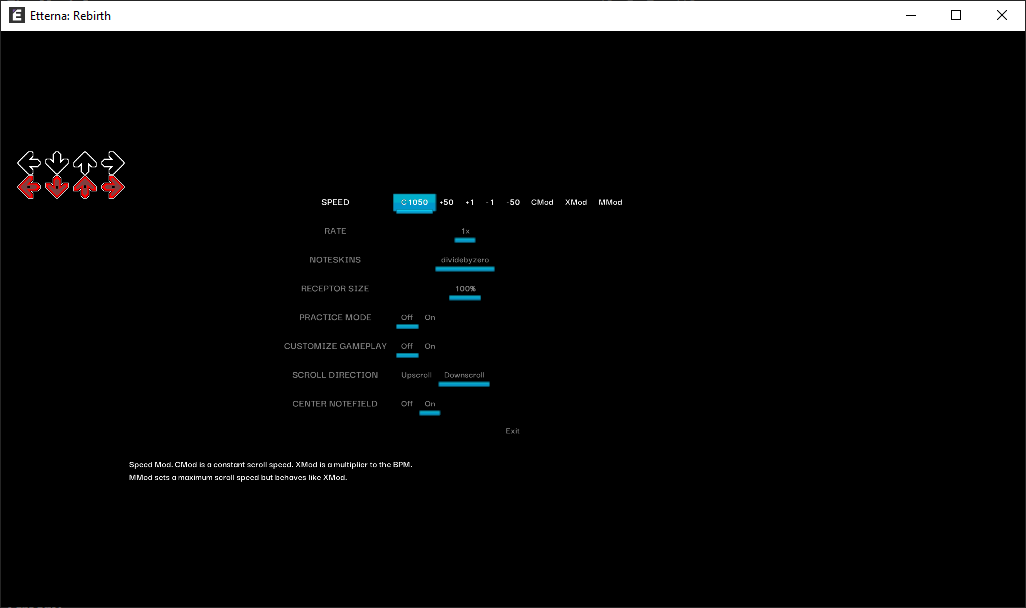
The only gameplay settings that carried over for me were cmod and reverse for some reason. Even mini got reset, SAD!
-
When you rename profile and click exit, the music doesn’t continue and rightclicking does nothing. Audio visualizer also got fucked.
reducing goal % by rightclicking no longer pauses the music, very good.
Customize gameplay gets disabled when you exit the song, very good.
-Adjusting errorbar width in customize gameplay takes fucking forever
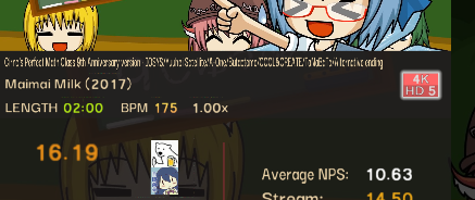
Eval screen
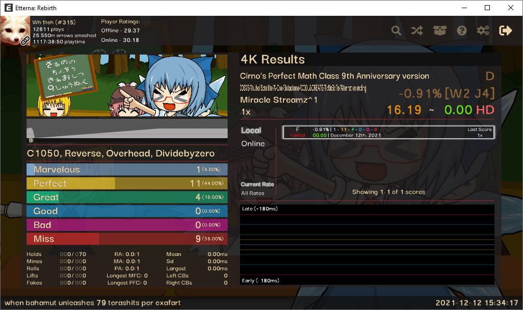
yeet pack name to the top, next to 4K results or something .
make artist font size smaller and give it more room horizontally .
make font for rate bigger, or emphasize it with placement more somehow, tho if you move the pack name somewhere else it might out stand out more already.
being able to see the leaderboard on eval is epic, being able to go to other scores eval is epic
I wish these didn’t use primary text color
overall just need to get used to a completely new layout.
Well that was all I noticed in like 1.5 hours, didn’t play much yet cus burnt as hell and also left thumb is hurting big pain. See ya!

